


April 19, 2018
10 Top Yearbook Design Rules
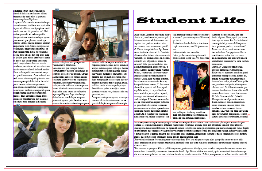
1) Grids for Page Clarity
- Grids are of different shapes and sizes and are quite flexible to your needs
- Useful for aligning elements of your page providing a neat, logical design
- Two, three or four column grids, which works best depends on your page content – more columns are ideal with full page editorial content
- You can stretch graphic/image elements over multiple columns giving your design flexibility while maintaining clarity
2) White (negative) Space is Not a Bad Thing
- Put more focus on a specific element of your spread, let your design breathe, provide balance and add sophistication to your work
- White space is not empty space; it allows what you want the reader to focus on to truly stand out – do not feel pressured to make every spread a collage
3) No Hanging Images (see grid above)
- Using a structured layout, as per the grid suggestion above or with frames, keeps things organized, allows each image to stand out and adds a professional look to your spread

4) Readability/Legibility over a Busy Design
- You design your spread to communicate a story in text and image form; this communication can get lost without considering readability/legibility in your design
- Things to keep in mind:
- keep contrast distinguishable between foreground and background elements
- do not overuse capital letters; they imply yelling and hamper the eye’s ability to distinguish letterforms, making it harder for the eye to identify each letter and word
- too small a type size, some readers may read it well enough, others may not; just because it fits doesn’t mean it communicates well
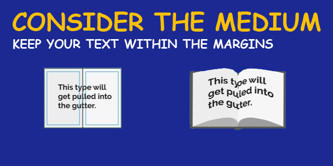
5) Consider the Medium
- Know the specs of your book because they dictate how your design is laid out
- A common mistake is not accounting for the features of a printed book; gutters, bleeds, margins and trim
- For example, a gutter is the space between two facing pages that is left both for readability and binding
- You must account for this during your design process which often means ensuring you do not place any graphics or type over the gutter
6) Keep Your Line Lengths Short
- Too short or too long lines of text are often difficult to read. The best number for line lengths is a minimum of six words per line and an average of about 30-40 characters (including spaces) on each line. Any less or more and you risk your sentences becoming tedious and difficult for the reader
7) Avoid Widows and Orphans
- A widow is a line of text that belongs to a paragraph and has moved over to the next column. An orphan is a single word on its own line
- There are a few ways you can deal with widows and orphans:
- You can manually edit the text to adjust the line length, place a soft return (press shift + return) on the word in front of the orphan to bring it down a line and adjust your textbox or column size to allow the text to move placement
8) Limit Your Colour Palette
- Colour is a powerful tool for your design but it should be consistent in tone throughout
- Each colour has a different effect on readers and everyone perceives colour uniquely
- Make sure that your use of colour isn’t too distracting to your reader
9) Limit Your Font Palette
- As you choose your colours carefully so should you choose your fonts
- Fonts have different effects as well, i.e. you wouldn’t use Curlz MT for text on a resume
- 2-3 fonts should be a maximum to avoid complicating your design. Choose fonts that complement each other and your make communication clear
10) The Importance of Grammar
- Following some simple grammatical rules can keep your designs looking professional
- Ampersands “&” should not be used in formal editorial content
- No double spaces after punctuation, one space only
- How to use hyphens and dashes of which there are 3 types: the hyphen (-), the en dash (–) and the em dash (—). The hyphen is used to join two words (i.e. “custom-built”); an en dash is used to connect numerical values (i.e. “2000–2017”); and an em sometimes used instead of a comma to indicate a pause in a sentence (e.g. “Grammar is helpful — more helpful than I thought”)
- How to use the word however, i.e. “I never enjoyed grammar; however, I know it is important.” In a sentence a semi-colon precedes the word and a comma after
- Missing commas in a compound sentence: i.e. “The sky was blue and clear and full of birds.”; should instead read as “The sky was blue, clear and full of birds.”