


May 05, 2022
Simple Setup
By Brad Schmidt, Colour Tech Support Specialist
When working on a book design, there seems to be an infinite number of details to consider. At times the simplest details turn out to be some of the more difficult ones to settle. One area that I am thinking about is the area of centring. There are many areas in a book where the position of text is carefully considered and where centring is often used. At first this seems like a trivial item, since every layout program includes an align left, align right and align centre option. I find that this topic is more nuanced, so we will explore some scenarios. Covers are a great place to start as there are several factors that turn the simple process of centring into an area of debate.
Hardcovers have a unique hinge feature, which turns this simple process of centring into an interesting discussion. The hinge area along the spine is usually around 0.375 inches to 0.5 inches. This hinge area is visible when looking at the front cover, but has the visual distraction of the indentation where the cover bends. The main discussion revolves around whether or not to include the hinge in the centring process.

There are three main ways the cover title can be centred on a hardcover. The first option is to ignore the hinge, focusing solely on the front panel. In this case, only the panel that contains the board is used for centring. The second option is to include the hinge and the entire front panel together as the full area to use for centring. A third option I have seen used is a compromise between the two, where half the hinge and the entire panel is used for the centring calculation. I think I have seen every combination used in the various cover designs printed at Friesens.
Often the cover treatment or type of hardcover will play a factor in determining which option to employ. When the title of the book is foil stamped on the front cover, we usually centre on the panel only. The background of the cover is often a solid paper colour and the crease of the hinge provides a visual barrier, giving the title a balanced appearance. When the title is very wide and approaches or extends into the hinge area, the visual barrier breaks down. The balance is interrupted and the title again appears off-centre. This could be the opportunity to use the third option. Nudging the title over to the right, using half the hinge in the centring calculation is enough to restore balance, while still keeping the title completely on the board.

I usually use the first option with a printed cover, including the hinge and panel together. If the cover has a photo background, the title looks off centre when the hinge is ignored, leaving an extra half inch of image on the left side of the title. This rule comes into question with some cover designs. One example is when a cover has a key line border that maintains an equal margin on all sides. When a key line is 0.25 inches from the edge, it will dip into the hinge area on the left side of the front cover. Here is an example where the printing of a border on the cover may look more balanced when centred on the board only.
Having compared the different options with centring titles on the front cover, we will move on to the spine and investigate some of the challenges with spine text. To centre the text, create a text box and rotate it 90 degrees. Most English language books will have the text running down the spine. Using the text frame options, the position of the text within the box can be altered. Here the text alignment is changed from top to centre. The text jumps to the centre of the text box. Depending on how the font was designed, the title may not be exactly centred. The text may need a slight adjustment, so nudge the box over slightly, or use the baseline shift.
Centring spine text is relatively simple when the same font size and typeface is used. Often the spine contains the title, author name, and company name and logo. When these are different sizes, use different fonts, or switch cases, the process is a little more complicated. Even if one word has ascenders or descenders and the rest do not, this can make the process of centring text on the spine more subjective.
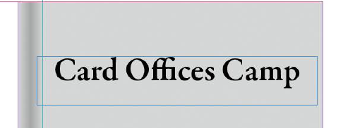
The type case used can also affect the centring. In the example spine, “CARD” is uppercase, “offices” is lowercase and “Camp” is mixed case. The centre option for the text frame works nicely for the word “CARD” as it is centred on the spine.
The word “offices” is also affected by the centring option, but visually appears to be more to the left side of the spine. This is because most of the letters only take up half the height of the uppercase characters. When looking at the word “Camp” the word looks very off-centre due to the descender on the “p”. Adjusting the centring based on the word “Camp” we would shift the spine text to the right. At this point we need to make a decision regarding centring. We can keep the baseline in alignment and then factor in both the ascenders and descenders in the centring. Alternatively, we can centre each group of words individually, allowing the baseline to change from “CARD” to “offices” and again when centring “Camp”.

Each spine will have different combinations to consider to produce an appealing result. When requesting changes to be done at Friesens, be very specific in communicating what is needed when requesting that text be centred. Each designer or prepress operator may come to a different conclusion regarding what looks best for centring.
One would think that centring text would be a simple process, but there are many factors to consider to improve the visual appearance when designing covers. Select the option that produces the best results for your design, and be aware of the challenges.
If you are curious about my cover title example, search ///card.offices.camp in the website https://what3words.com