


SHADES OF GRAY
The recommended grayscale values require updating over time as calibrations are changed and equipment is updated. The topic of highlight and shadow values is an aspect of grayscale image preparation that we do not stress as much as we did ten years ago when profiles were less of the norm in image preparation. Over this time, we have taken steps to bring our different printing processes into alignment so there is more consistency between preparing grayscale images for coated and uncoated paper. In the past the recommended highlight and shadow values were quite different when considering printing on sheetfed or web presses. Coated and uncoated papers required different image preparation. Now with a more standardized approach the highlight and shadow values are similar regardless of the paper used.
When converting images to grayscale, we recommend using an appropriate profile based on the paper selected. For coated paper we recommend the Grayscale GRACoL_Coated profile and for uncoated paper we recommend the Grayscale GRACoL_Uncoated profile. Both these profiles are available on the Friesens website by filling out the online form in the Colour Management section. http://books.friesens.com/pre-press-services/
A good halftone starts with a high quality scan or good digital camera photo. Even a mediocre grayscale image can be improved by adjusting the highlight and shadow values in Photoshop.
Here is an image of roses with very little contrast. The condition of this image has been exaggerated for illustrative purposes. The highlights in this image are printing at 29% Black while the shadows are printing with 60% Black. Open the Levels palette to begin optimizing this image. The highlight and shadow adjustment performed here using the Levels, is not to be confused with the Shadows/Highlights dialog in Photoshop that performs a different function.

Begin by adjusting highlight values with the right slider of the input levels. Shift the right slider to the left until the lightest area of the image reads 0%. Holding the [Alt] key (Windows) or [option] key (Macintosh) while moving the slider will assist you in determining how far to move the slider. Initially the image will turn completely black. Continue to move the slider until small areas of white appear. These areas will now be printing 0% Black. The result of this adjustment to the image is seen here.
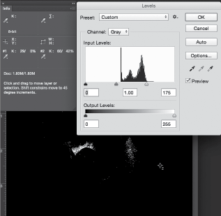
The before and after values of the highlights are shown in the info palette beside #1 as (K: 29 / 0%).
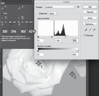
The second step is to adjust the shadow values by using the left input slider. Move this slider to the right until the darkest area of the image reads 100% Black. As with the previous adjustment Hold the [Alt] key (Windows) or [option] key (Macintosh) as you move the slider to the right. Initially the image will turn completely White. Continue to move the slider until small areas of black appear. These areas will now be printing 100% Black. The before and after values of the shadows are shown in the info palette beside #2 as (K: 60 / 100%).


The highlight and shadow values have now been set to 0% and 100% which creates an image with the most contrast possible. Adjust the centre input slider to the desired midtone settings. The value for the midtones is subjective. Select a value that provides the best appearance.
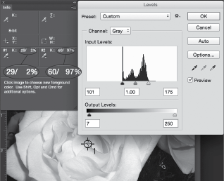
For coated paper the optimal highlight and shadow values are 2% and 97%. To maintain the dot structure on uncoated paper the recommended highlight and shadow values are set to 3% and 97%. The final highlight and shadow values are set by entering 7 and 250 in the output levels for coated paper or 7 and 247 for uncoated paper. The info palette shows the updated 2% and 97% values. The image above shows the completed optimization for coated paper.