


May 15, 2023
The Psychology of Fonts
When creating text communications, the words you’re sharing is only half of what you’re sharing with the world. The rest comes from the visuals of how you present your information.
So what is Font Psychology? Simply put, it’s the study of how we perceive fonts to have certain emotions or associations. This can be broken down into two separate types – brand association and general emotion association
Brand Recognition
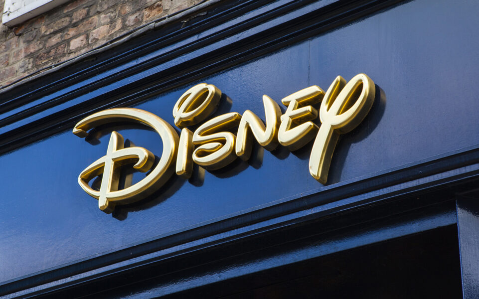
This one’s pretty self explanatory, some fonts are so associated to major brands that it’s immediately what you think of when you see it. That may come in the form of utilizing a pre-existing font (such as Spotify using Gotham), or the creation of a new, custom design (ie. Disney).

While fonts that come with instant recognition have some great advantages, be careful about copyright usage, and keep in mind that association with a specific brand may age poorly.
General Emotions
This may seem like a much more nebulous train of thought, but the connection between specific font types and the emotions they’re associated with are a massive part of marketing and brand creation. Even something as simple as Serif vs Sans-Serif vs Script can make a change in how your print is perceived.


When creating any piece with text, it’s important to keep this in mind to ensure that the feel of your work matches the content. But we can go a bit deeper to see just how a small change can make a huge difference to how your composition is viewed.
Breaking Down Fonts
So what else can your font say for you? Let’s get into some of the specifics of how you can share emotion and value without saying (or typing) a word. We’ll go through some common font types and break down what the associations are.

Light, tall thin fonts often convey beauty, femininity, and delicacy. They are usually gentle and soothing. Bold fonts are often seen as daring, assertive, or solid. More often associated to masculinity and can be seen as aggressive.

Rounded, bubble style fonts are often comforting. You’ll often see this in items for children, or sweet food items. Sharp fonts, by contrast, are often seen as aggressive. You’ll see it on formal or official pieces of paperwork, as well as foods that are bitter or sour.
Even within these designations there are variations. Simply shaped letters allow for direct communication and ease of reading, while complexity gives a uniqueness and spontaneity but can make it difficult to read in larger chunks. Something as simple as a slant can convey movement, and shorter fonts can display stability while tall fonts are airy and luxurious.
The next time you’re reading a magazine (print or digital!) or looking at a poster, stop to really pay attention to the fonts the designers chose. What do they tell you? And how can you bring that into your own publications?