


March 20, 2019
March: Design Tips
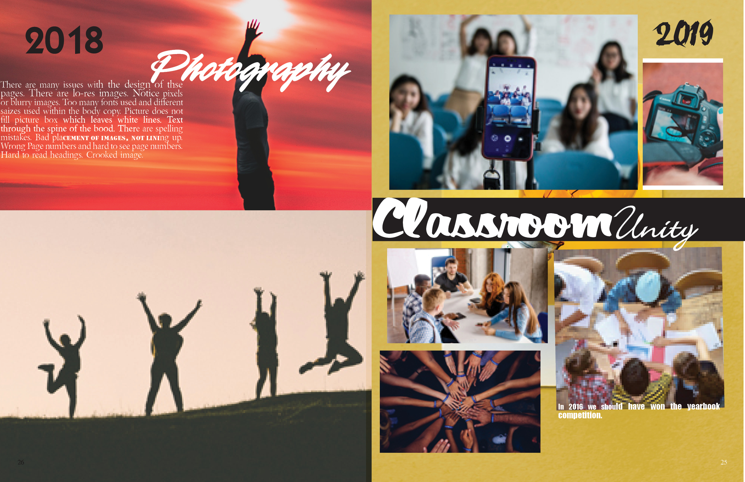
Back in December, we gave you some design tips on how to create consistency in your book. Below is a spread where we’ve created common design errors – can you catch them all?
Add to answer key
- Many images are lo-res
- Page number on the left-hand page is too dark, hard to read and the wrong page number.
- The caption is half on the picture, and half off.
- Top right image does not fill the picture box and leaves white lines.
- Headline “Classroom” is too close to the spine.
- The story under 2018 is too close to the edge. It may get cut off.
- Background on the right-hand page does not bleed.
Danielle Abrams
Friesens Customer Service Manager