


July 06, 2021
Familiar Tools
by Brad Schmidt, Colour Technical Support Specialist
In the past few articles I have explored new software and its potential as an alternative to the more established programs. I have also looked at updates to our website and specifically the expansion of available ICC profiles on our website. I have already seen the fruits of this effort as I have directed customers to this expanded resource. In this article, rather than focusing on new, cutting-edge tools or techniques; I want to revisit one of the fundamental tools to discover some of the hidden features that have been there all along.
One of the most fundamental tools within InDesign is the ability to assign colours to objects. Even though this is one of the basic attributes that is assigned to text and images, it is still an area that we find requires adjustment after files are pre-flighted. Within the swatches palette there is a full range of options to make colour selections.

Within the Swatches there are four reserved colours differentiated by square brackets. These reserved colours [None], [Registration], [Paper], and [Black] are already enough options to create pre-flight issues. The most notorious and misunderstood colour in this list is [Registration]. On many occasions I have seen this colour selected and used for black text. Visually, both [Black] and [Registration] appear the same on screen. When printed on a composite printer such as an inkjet or a laser printer, the output of [Black] and [Registration] appear the same. This hides the fact these are fundamentally different colours. The purpose of the [Registration] colour is for use in marks such as fold lines or trim marks. For black text, [Black] should be used because it prints 100% black only. When [Registration] is used for text, it prints 100% Black, plus 100% Cyan, 100% Magenta, and 100% Yellow. This is especially noticeable if only part of a paragraph uses [Registration]. The [Registration] text stands out as looking bolder than the surrounding text and the excess ink can cause pages to stick together or ink to transfer to the facing page.
Another colour that often escapes people’s notice is the [Paper] colour. One of the lesser known features of the [Paper} colour is that you can actually change its colour. You will notice that there is no white colour in the list of colours in the Swatches. Most often we just assume that [Paper] in this list is white. But you can actually change the [Paper] colour so that if you are using a cream stock, you can add some yellow to the [Paper] colour and all your pages will have a cream appearance. This can be a real puzzle when you try to find the cream-coloured box but there is none to be found. The first time I encountered this it was quite a search before I discovered the source of the document’s mystery background colour. An interesting fact about altering the [Paper] definition is that it has no effect on the printing. It only alters the appearance in InDesign.
By taking a few extra steps at the beginning of a project, you can save a significant amount of work later in the process. Much like the way character and paragraph sheets define and standardize text, Swatches are a way to standardize colours. If colours are selected from the Swatches palette in the beginning, when a document is created, modifying or swapping colours can be accomplished easily.
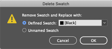
One nice feature is the ability to delete a colour that you want to change. InDesign will ask you to select an alternate colour to use as a replacement. This works great for any custom colours you have added to the Swatches palette. If the colour you are trying to replace is one of the reserved colours, such as [Registration], this delete and replace feature will not work. You will be better served using the expanded Find/Change feature that allows for a colour Find/Change.

Another area of interest in the Swatches palette is the creation of spot colours. Spot colours are easy to identify because of the square icon with the dot in the middle. In the Swatches palette earlier in the article there are two PANTONE 526 colours. Note that one is darker and the other is lighter. The ink recipe for each of these spot colours is identical. The reason that PANTONE 526 U appears lighter than PANTONE 526 C is that ‘C’ represents coated paper and the ‘U’ represents uncoated paper. Since the ink is identical, InDesign is showing the visual difference that printing on coated and uncoated paper will have.
There is also a special colour option within the Swatches palette that allows for mixing of inks. If you have printed a duotone project, you will be familiar with images that are printing with a combination of two inks. For duotones, this is often the combination of black and a spot colour. The relationship between these two colours is defined by the duotone curve in each image. To create a background colour that is a combination of the black and the spot colour, you could create some type of duotone and place it as a background colour, but there is also a way to create this type of colour in InDesign. From the Swatches menu, select ‘New Mixed Ink Swatch.’ Here the ink combinations along with the percentage of each ink can be specified, The new mixed ink will be listed in the Swatches where it can be applied to objects such as a box for background colour.

I hope you discover that these less common features of a familiar tool will be helpful in improving your file creation. Designers I have the opportunity to work with often introduce me to new areas of InDesign, because they use the program in ways that I would not even have considered. Thanks for always keeping my job interesting.