~ by Michele Fiyak-Burkley, Sales Representative – U.S. Gulf States
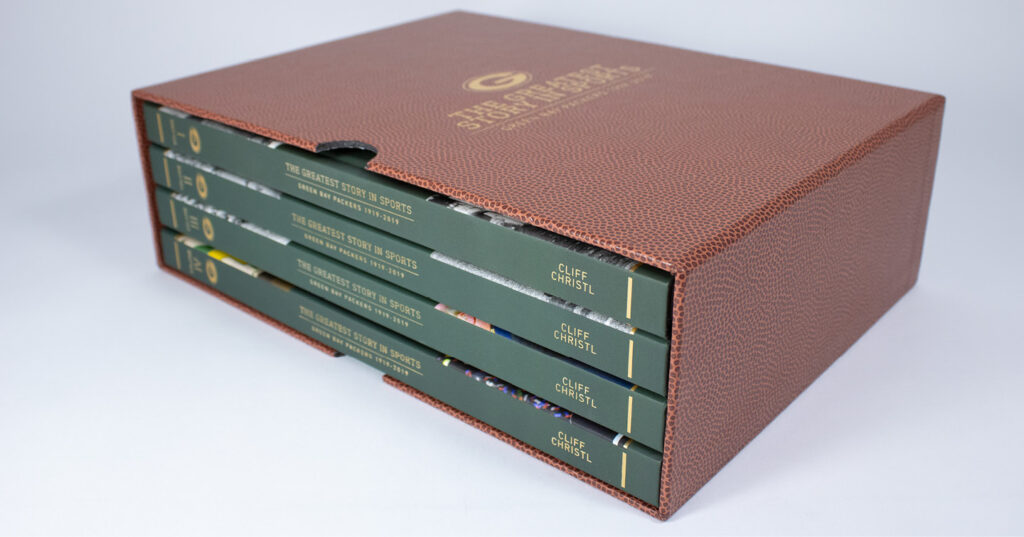
When people think about book design, they usually focus on the cover. It’s understandable – the front cover appears in online stores, promotional graphics, and social media posts. But when a book enters the real world, something else often becomes the more important visual: the spine.
Books spend most of their lives on shelves. In bookstores, libraries, offices, and personal collections, the spine is often the only part visible to readers. A beautifully designed cover may grab attention online, but a well-designed spine is what helps a book stand out for years to come.
THE FIRST IMPRESSION ON THE SHELF
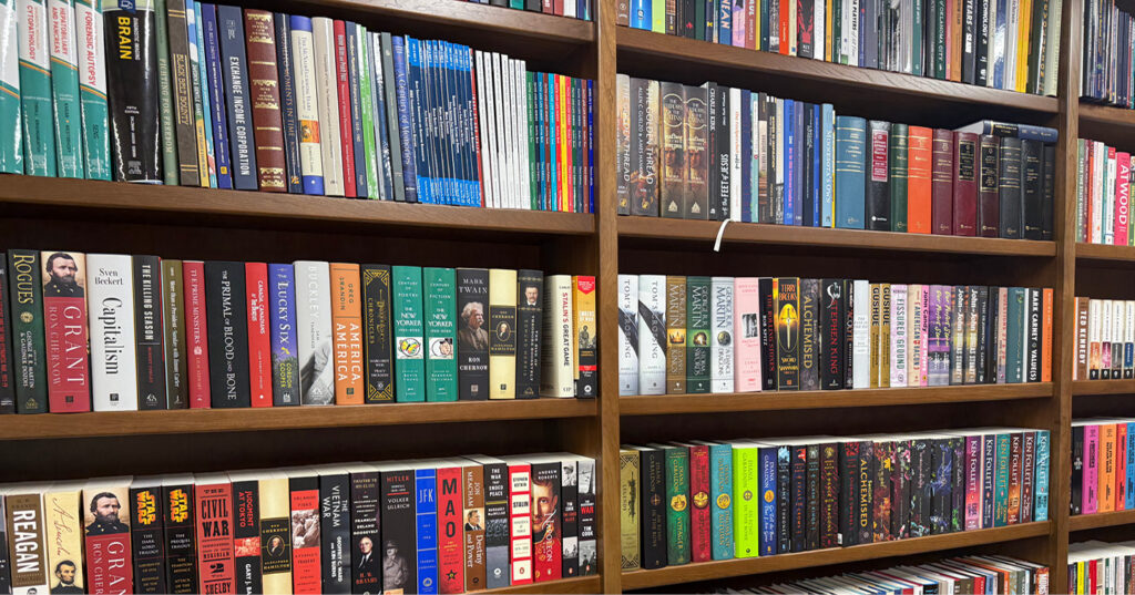
Consider how people browse a bookshelf. They’re not seeing the front covers of hundreds of books; they’re scanning rows of spines, looking for one that catches their eye. A strong spine can:
- Make a book easier to find
- Reinforce its brand or series identity
- Communicate genre and tone
- Increase visibility in retail and library environments
- Create a memorable impression long after purchase
In many ways, the spine is the book’s permanent advertisement.
DESIGN CONSISTENCY MATTERS
A spine should feel like a natural extension of the overall cover design. The typography, colors, texture, and visual style used on the cover should carry through to the spine. Consistent design helps create a cohesive package and strengthens recognition on the shelf. Designers often use the same fonts and color palette from the front cover, while adjusting as needed to improve readability.
This becomes especially important for book series, where consistent spine design helps readers instantly recognize related titles.
READABILITY COMES FIRST
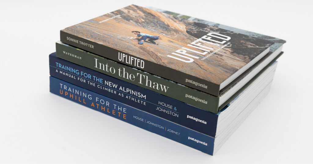
A decorative spine may look impressive, but if readers cannot easily identify the title or author, it isn’t doing its job. When choosing spine topography, consider the following:
Font Selection
Choose fonts that remain legible at small sizes. Intricate scripts or highly decorative typefaces may work beautifully on a cover but become difficult to read when compressed into a narrow spine.
Typeface Weight
Fonts that are too thin can disappear, especially on darker backgrounds. A heavier weight often improves visibility.
Contrast
Make sure there is enough contrast between the text and the background. Dark text on a dark spine or light text on a light background can quickly become unreadable from a distance.
Text Orientation
Most books feature vertical spine text, but a wide spine may allow the designer to place text horizontally. The direction should be considered carefully, as consistency within a publishing program or series creates a more professional appearance.
Cover Treatments
Some cover treatments, such as foil stamping, can work well on a spine, while others do not. The type of cover spine you are designing (softcover, hardcover case, or dust jacket) will impact how well different treatments will work. Discuss your plans with your Project Specialist.
UNDERSTANDING SPINE WIDTH
One of the biggest design challenges is that every spine has physical limitations. The width of a spine is determined by factors such as:
- Page count
- Paper thickness
- Binding style
- Cover construction
A wide spine offers plenty of room for typography and design elements. A narrow spine requires much more restraint.
Keep in mind the same text margins recommended for the front cover are also needed on the spine, so a 1” spine does not provide a full 1” of useable design space.
Similarly, very thin spines can become especially challenging. Manufacturing guidelines recommend avoiding all typography on extremely narrow spines because small variations during production may cause text to wrap onto the front or back cover.
Before investing significant design time into a spine concept, it’s important to confirm the final spine width with your Project Specialist.
CONSIDER THE FULL SHELF EXPERIENCE
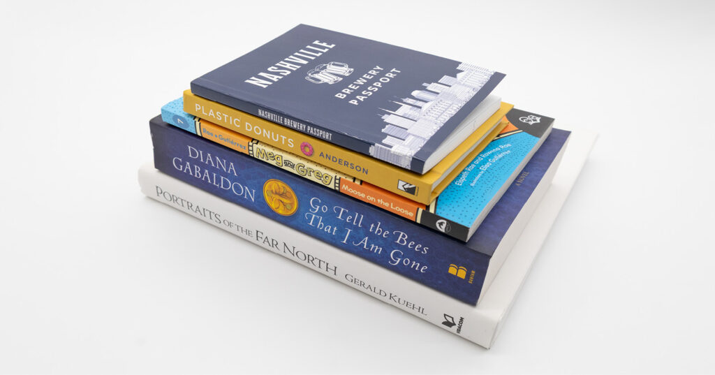
A spine doesn’t exist in isolation. Think about how the book will look beside competing titles in a bookstore, next to other books in a series, in a library collection, or on a reader’s personal bookshelf.
Sometimes the most effective spine isn’t the loudest one. A clean, elegant design that aligns with the audience and genre often stands out more than a spine overloaded with graphics and effects.
SMALL SPACE, BIG IMPACT
The spine may be the narrowest part of the book, but it carries an outsized responsibility. It helps readers find the title, strengthens brand recognition, and often becomes the lasting visual representation of a book.
When designing a book cover, don’t treat the spine as an afterthought. Give it the same attention you provide the front and back cover. After all, when a book is sitting on a shelf for years to come, the spine is doing most of the work.

Michele Fiyak-Burkley works with publishers throughout the U.S. Gulf States, helping them bring their books to life. Having previously worked in publishing herself, she understands the challenges, deadlines, and pressures customers face. That perspective allows her to provide thoughtful guidance and dependable support when it’s needed most.
When she’s not working, Michele enjoys travelling, reading, hiking, exploring new places, and spending time with family and friends.